Every year, brand-tracking programmes field hundreds of surveys: the same battery of questions, asked across audiences and categories, wave after wave. It is the backbone of how brands understand where they stand. It is also expensive, and a surprising amount of it tells you what you could already have worked out.
That last part is the interesting bit. In a new study using WPP’s Brand Asset® Valuator (BAV) data, we turned a familiar research question inside out. Instead of asking “how accurate can our tracking be?”, we asked the question a marketing or finance director would ask: “how few surveys can we run and still have data we are prepared to act on?” The answer, on the programme we tested, is about two-thirds of them. This post explains how we got there, what the trade-off looks like, and what it means for the way you plan fieldwork.
The expensive habit nobody questions
Brand tracking tends to treat every market the same. Point the same instrument at every audience and category, run it, then run it again next wave. The bill adds up fast. Published figures for professionally run surveys land around $17 per sampled person and $41 per completed questionnaire, rising to $110 per complete for some designs. These are US academic figures, but the economics travel, and they climb every year as response rates fall and each completed interview takes more effort to win.
There is a quality tax on top of the money. The more often and the longer you survey people, the more they rush, guess and drop out, so over-surveying can quietly erode the very accuracy it is meant to buy.
Meanwhile, markets are not equal in how much fresh measurement they need. Brand perceptions are sticky in some places and volatile in others. Some of your surveys move a lot between waves. Some barely move at all, and their results could have been predicted from the rest of the programme with useful precision. Treating both kinds the same means spending money where the answer was already in the archive.
The key insight: accuracy is a line you set, cost is what you cut
Here is the shift in thinking that makes the rest work.
Most conversations about predicting survey results get stuck on one question: “is the prediction accurate enough?” Asked that way, the answer is always “it could be better, at a price,” and the conversation goes nowhere.
We flipped it. The brand team decides in advance the lowest accuracy it is willing to act on. Call it the good-enough line. Then the job is to find the cheapest fieldwork programme that clears that line, and to predict everything else. Accuracy is not the thing you chase. It is a floor you refuse to go under. Cost is the thing you minimise.
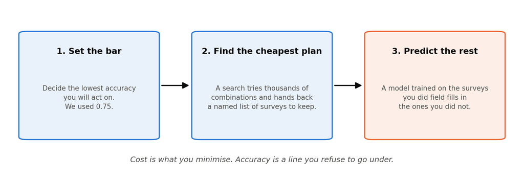
Figure 1: Set the bar, find the cheapest plan, and predict the rest.
Put that way, three moves follow naturally.
Set the bar. For this study we set it at 0.75 on a standard accuracy measure (R², which runs from 0 for useless to 1 for perfect). That is a demonstration, not a recommendation. A tracker that feeds boardroom reviews can live with a lower bar than one that triggers spend market by market.
Find the cheapest plan. A “survival of the fittest” search (a genetic algorithm) tries thousands of combinations of surveys and hands back a named list of the ones to keep fielding. Named matters. A percentage tells you how much to cut; a list tells you what.
Predict the rest. A model trained on the surveys you did field fills in the ones you did not. Because every survey is described by the same handful of ingredients (audience, category, brand, attribute), the model learns how each ingredient shifts a brand’s scores and applies that to combinations it has never seen.
What each slice of budget buys you
The most useful thing the study produces is not a single number, it is a curve.
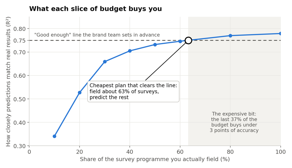
Figure 2: Prediction accuracy against the share of surveys fielded, showing the good-enough line at 0.75.
Read it left to right. Field 10% of your surveys and predictions are poor. Field 30% and they are already respectable. Field 60% and they are close to as good as they will ever get. After that, every extra survey buys less than the one before. On this programme, going from 63% of surveys to 100% of them lifts accuracy by under three points on a 100-point scale, and that final stretch is more than a third of the entire fieldwork budget.
This is the whole argument in one picture. The curve flattens, so the last few points of accuracy are the most expensive fieldwork you will ever buy. A programme that insists on the highest possible accuracy is paying its highest price for its smallest gain. Choosing to stop at the good-enough line is not a compromise on quality. It is the same logic you apply to every other budget you own.
The curve also lets you price any bar you like. Happy with 0.70? Field about 39% of the programme. Want 0.775? That will cost you about 91% of it. The conversation between research and finance can be had in one currency.
What we found
We tested this on the 2023 wave of BAV in the United States: 130 surveys (13 categories by 10 audiences), each scoring 10 brands on 46 attributes, nearly 60,000 data points in all. We held 26 surveys back as a hidden test set that the model never saw, so every accuracy figure below is on markets it had to predict cold.
About a third of fieldwork is predictable. At the 0.75 bar, the cheapest plan fields roughly 63% of surveys and predicts the rest, a fieldwork reduction of about 37%. Fielding everything would reach only 0.78.
The search returns a list, not just a number. On the training pool of 104 surveys, the genetic algorithm found a committable core of 81, a 22% reduction, with accuracy essentially unchanged (0.777 to 0.775). Being honest about this one: random selection can hit the bar with fewer surveys than the search found, because the search stops the moment it clears the line and does not keep pushing on cost. The search’s value is the named list you can act on, not a smaller number.
The obvious shortcut does not work. We also tried filtering out the hardest-to-predict slices before compressing. On this data it made predictions worse at every threshold we tried. The model’s interaction features already capture what filtering would remove, so compression works at the level of whole surveys, which is also the level at which you actually buy fieldwork.
The trap: last year’s plan does not travel
Here is the finding that should change how you plan.
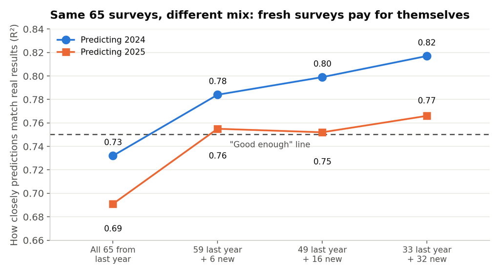
Take the surveys the search chose on 2023 and carry them, unchanged, into 2024 and 2025. Accuracy drops below the bar, to 0.73 and 0.69. Markets move, and a plan frozen on one wave goes stale on the next.
The fix is not to abandon the plan, it is to dilute it.
Figure 3: Accuracy rises as fresh surveys replace last year’s selections within a fixed 65-survey budget.
We held the budget fixed at 65 surveys and varied the mix. Spending all 65 on last year’s chosen surveys was the worst use of the money. Swapping just six of them for fresh surveys of the new wave lifted accuracy by five to six points. Swapping half was best, lifting it by eight points in both years at identical cost, and back above the bar. And the fresh surveys were picked at random. No clever selection needed; the model simply needs some measurement of the wave it is predicting.
So the deployment rule is simple. Under a fixed budget, reserve about half of it for fresh measurement of the wave you are planning, and let the model reconstruct the rest.
What this means if you run a tracker
Use it to plan, not to autopilot. Treat the predictions as a confident starting point that frees up budget, not a verdict that retires a market for good.
It is reallocation, not retreat. The point is not to survey less for its own sake. On these data, about a third of fieldwork spend could be redirected from predictable surveys towards the markets where fresh measurement demonstrably adds information, or simply saved.
Set the bar deliberately. The good-enough line is a management decision, not a modelling one. Decide it based on what the data is used for, and use the curve to see what it costs.
Refresh every wave. Do not carry last wave’s plan forward untouched. Mix in fresh surveys of the target wave, roughly half the budget on the evidence here.
Watch for shocks. A new entrant, a scandal, a viral moment can turn a stable market volatile overnight. The model cannot anticipate a structural break; only people watching the market can.
It is reallocation, not retreat. The point is not to survey less for its own sake. It is to move a meaningful share of the budget — on these data, somewhere between a quarter and two-fifths of it — out of predictable slices and into volatile ones, where fresh measurement demonstrably adds information.
Use savings strategically. Reduced fieldwork can mean lower cost, but it can also mean better coverage: expanding into new markets, adding new audiences, or going deeper where the evidence is most decision-relevant.
Build in safeguards against drift. A slice that was predictable last year may not stay predictable forever. A new entrant, scandal, viral moment, campaign, or category disruption can change the market quickly. A deployed system should therefore include two safeguards. First, continue to field a small sample of otherwise “skippable” slices as a robustness check. Second, avoid using predicted values as if they were fresh observations in the next wave. In other words, do not let estimates compound into future estimates without being periodically re-anchored in real fieldwork.
Use it to plan, not to autopilot. Treat the predictions as a confident starting point that frees up budget, not as a final verdict that retires a market for good.
The bottom line
Brand tracking does not have to be all-or-nothing, measure everything or fly blind. The data already in your archive can tell you, with useful precision, which surveys are worth re-fielding and which can be predicted from what you already know. And once you frame it as a budget decision rather than an accuracy contest, the answer to “why isn’t the prediction more accurate?” becomes obvious: because the last few points cost more than they are worth, and you chose not to buy them.
It is, in a sense, the mirror image of the synthetic-audiences debate. That conversation asks whether AI can replace the respondents. This one asks a more immediate and less risky question: of all the surveys you are about to run, which ones do you even need to? For roughly a third of them, the most honest answer is that you already have the data.
Sources and further reading
A curated subset of the work behind this post; full citations appear in the paper.
Olson et al. (2024), “Examining variation in survey costs across surveys,” Sociological Methods & Research: the per-survey cost figures.
Groves & Heeringa (2006), “Responsive design for household surveys,” Journal of the Royal Statistical Society A: survey cost as a constraint to be traded against accuracy.
Bronnenberg, Dhar & Dubé (2009), “Brand history, geography, and the persistence of brand shares,” Journal of Political Economy: why some markets barely move.
Prokhorenkova et al. (2018), “CatBoost: Unbiased boosting with categorical features,” NeurIPS: the recovery model.
Yang et al. (2023), “Dataset pruning,” ICLR: why large fractions of training data are often redundant.
Argyle et al. (2023), “Out of one, many: Using language models to simulate human samples,” Political Analysis: the synthetic-audiences counterpoint.
Disclaimer: This content was created with AI assistance. All research and conclusions are the work of WPP Research.
The BAV Research Pod is a dedicated intelligence hub that leverages WPP’s BrandAsset® Valuator (BAV), the world’s largest, most enduring study of brand equity, to unlock advanced methodologies and strategic efficiencies. In its inaugural paper, the pod tackles the millions of dollars wasted annually on redundant brand-tracking surveys. By developing a predictive methodology that analyses historical BAV data, the team successfully simulated roughly half of the standard surveys with no loss in accuracy, even a year later. The result is a dynamic roadmap that tells brands exactly where consumer perception is moving, allowing them to eliminate redundant fieldwork and shift budgets to where measurement actually drives value.
We build synthetic data infrastructure for marketing machine learning. Our work focuses on encoding marketing compatibility knowledge into signed graphs. We use large language models (LLMs) to capture which combinations of brands, audiences, platforms, and geographies are expected to perform well together or conflict. This knowledge is then turned into controlled, labelled campaign performance datasets at scale. The result is a system designed to unblock model training and experimentation before real campaign data is available, giving teams precise control over the data.
For an easier-to-understand overview of this report, please see our non-technical version here.
1. Motivation
Marketing Machine Learning (ML) models require large, labelled datasets that connect campaign attributes — such as brand, audience, platform, and geography — to measurable performance outcomes. Real data, while the ultimate source of ground truth, is often sparse, constrained by the distributions of what has already been observed, and requires significant effort to bring into an AI-ready format.
Synthetic data serves as a powerful accelerator in the meantime, offering precise control over distributions of performance labels, dataset sizes, noise levels, and coverage across multiple scenarios and marketing domains. This flexibility makes it possible to train more robust models and iterate faster, without being dependent on the availability of real campaign data.
2. Problem Definition
Random attribute combinations are not useful unless they reflect the real world, so the challenge is to generate synthetic data that is grounded in marketing knowledge. For example, a dataset that pairs a luxury brand with a budget-sensitive audience and labels it as high-performing will actively mislead any model trained on it. So any dataset generator must be built on a structured and reliable source of marketing knowledge.
Building synthetic data therefore requires two things to exist first:
Marketing knowledge encoding: there is no readily available structured representation of how marketing attributes interact with one another. We need a way to capture which combinations of brands, platforms, audiences, and locations are expected to perform well together and which are likely to conflict across the full combinatorial space a model needs to learn from.
Synthetic dataset generation: given a reliable source of marketing performance knowledge, we need a mechanism to generate diverse, valid campaign configurations, each combining multiple attribute values, and assign them realistic performance labels at scale.
This project addresses both by implementing a service capable of leveraging large language models to encode marketing compatibility knowledge into a structured format, and a second service that consumes that source to generate realistic, labelled campaign performance datasets at scale.
2.1 Proposed Solution
Signed graph as marketing knowledge source
The structured format chosen to represent marketing compatibility knowledge is a signed graph (Figure 1). Each node represents a specific marketing attribute value (a brand, a platform, an audience interest, or a location), and each edge carries a sign encoding the nature of their relationship. A positive edge means the two marketing attributes are expected to work well together in a campaign; a negative edge means they are likely to conflict. The result is a web of marketing compatibility knowledge that grows richer as more attributes are added.
Graph example
This structure has been chosen because it can naturally capture the many-to-many nature of marketing relationships. It is also easy to extend: adding a new brand or platform simply means adding new nodes and connections. Finally, the graph is interpretable, meaning it can be visualised, inspected, and validated by domain experts, making it easier to audit and refine.
Synthetic dataset generation
The second challenge is converting this marketing knowledge graph into synthetic data that a model can actually train on. Generating data from a graph is non-trivial: the combinatorial space of possible attribute combinations is too large to enumerate exhaustively, and random sampling would not yield the controlled, structured scenarios or label distributions required for effective model development.
The proposed dataset generator addresses this challenge by providing a configurable service that, given a graph as input, samples attribute combinations subject to defined structural constraints, assigns performance labels grounded in the graph’s compatibility signals, and produces versioned, labelled datasets at scale for model training.
3. The Computational Bottleneck in Pairwise Graph Generation
The most straightforward approach to building a signed graph is exhaustive pairwise classification: prompting an LLM for every possible pair of attribute values and recording the result as an edge. The challenge lies in how quickly the number of pairs grows.
For a graph covering 50 brands, 100 audience interests, 10 platforms, and 20 geographic locations, exhaustive pairwise classification already requires approximately 14,500 LLM calls. This number grows quadratically with the size of the attribute space: at 200 brands, 200 interests, 20 platforms, and 50 locations, the call count exceeds 100,000.
This makes exhaustive classification too expensive for routine use and too slow to support iterative development. It also raises a central challenge: if exhaustive evaluation is infeasible, how should the pairs to classify be selected? Addressing this limitation became a central Q1 technical goal: to identify a graph generation strategy that preserves the quality of LLM-based edge classification while remaining scalable.
4. Graph Generation Strategies Evaluated
4.1 Implementation A – Batched Brute-force Pair Classification
In the brute-force approach, all possible combinations of attributes are generated, and the LLM is asked to classify the expected performance relationship for each pair. This strategy provides broad coverage because every pair is evaluated. However, it introduces two important issues.
First, the prompt implicitly frames each pair as something worth relating, which can introduce framing bias. As a result, pairs that likely have no meaningful relationship may still receive a weak or speculative classification, making the generated graph overly dense.
Second, research has shown that such constrained output formats, such as +, -, or 0 to classify performance, systematically suppress LLMs’ natural reasoning processes and force premature commitment to answers (Tam et al., 2024; Yu et al., 2025).
To reduce the number of LLM calls, batch prompting was introduced so that multiple attribute pairs could be classified in a single request. While this improves efficiency, it may also amplify the second issue.
Potential issues and challenges:
Overly dense graphs with many spurious or low-confidence edges.
Computational cost explosion due to quadratic scaling of LLM calls.
Increased hallucinations from batch classifications and structured output.
4.2 Implementation B – Cluster-Based Pre-filtering
This implementation uses a hierarchical strategy to reduce LLM scoring calls without sacrificing edge quality. Attributes are embedded and clustered per modality using HDBSCAN (with optional UMAP reduction for larger datasets), then an LLM scores only cross-modality cluster pairs rather than all attribute pairs. Cluster pairs falling within a neutral band are discarded, and attribute-level edges are considered only from surviving cluster combinations, reducing the evaluation space from O(n²) attribute pairs to O(k²) cluster pairs, where k is smaller than n.
Potential issues and challenges:
Sensitivity to embedding and clustering quality.
The threshold defining the neutral band is a manual parameter. Set too aggressively, it discards semantically meaningful cluster pairs; set too loosely, it recovers the density problem of Implementation A.
Increased hallucinations from batch classifications and structured output.
5. System Overview
The pipeline consists of two services operating in sequence that will be integrated in one service in the future. The Graph Generator Service takes a versioned list of marketing attributes and produces a signed graph encoding compatibility relationships between them. The Synthetic Dataset Generator then consumes that graph to produce labelled campaign performance datasets ready for model training.
5.1 Graph Generator Service
The edges generator receives a versioned list of attributes as input and produces a CSV file representing signed relationships between attributes.
The output is a signed edge file in CSV format, where each row represents a relationship between two attributes and an inferred performance signal.
The output schema includes the following fields:
source: the origin attribute in the relationship
target: the related attribute connected to the source
rel: the relationship type, typically indicating the modalities involved in the connection (for example, audience_to_brand)
sign: the inferred polarity of the relationship, where + indicates a positive association and – indicates a negative association.
General Configuration
Both implementations share a fixed set of parameters to ensure that observed differences in graph quality are attributable to the generation strategy rather than configuration.
Parameter
Value
LLM model
gemini-3.1-flash-lite-preview
Embedding model (when applied)
gemini-embedding-2-preview
Temperature
0.15
Max attributes per batch call
25
Concurrent LLM workers
7
Execution configuration
Temperature is set to 0.15 (near-deterministic but not fully greedy) to reduce output variance across runs while preserving enough flexibility for the model to handle pairings without defaulting mechanically to the same answer.
The batch size of 25 attributes per call balances context window efficiency against classification degradation: larger batches for quality classification tasks reduce LLM calls but increase the risk of the model losing focus or producing inconsistent signs across a long list of targets (Van Can et al., 2025).
5.1.1 Brute force approach pipeline
The brute-force pipeline enumerated all valid cross-modality attribute pairs from the catalogue and submitted each to gemini-3.1-flash-lite-preview for sign classification. To reduce the total number of API calls, pairs were grouped into batches rather than submitted individually. Each pair was assigned one of three labels: positive (+), negative (-), or neutral (0). Neutral pairs were discarded from the output to simulate real data sparsity.
Prompting strategy
The attribute-level classification prompt defines labels in terms of real campaign behaviour. A positive label (+) requires an obvious and natural strategic fit, strong audience overlap, clear brand alignment, and a combination that demonstrably drives higher ROI. A negative label (-) applies when the combination creates friction, wastes ad spend, targets conflicting demographics, or causes brand dissonance. Neutral (0) covers pairs with no meaningful performance signal, standard baseline performance, or combinations that are simply unrelated.
To reduce speculative classifications, the prompt includes an explicit evaluation mindset guardrail: the model is instructed not to invent creative edge cases to justify a pairing, to treat any combination requiring unconventional reasoning as a mismatch, and to default to neutral when uncertain. This guardrail is critical in a batch classification setting, where the model might otherwise be biased toward generating signal on every pair it evaluates. Full prompt templates are provided in Appendix A.
Brute-force flow diagram
5.1.2 Cluster-based approach pipeline
The clustering pipeline operated on the same attribute catalogue and followed a four-stage process.
Embedding: attributes were embedded using the latest Gemini embedding model (gemini-embedding-2-preview)
Per-modality clustering: attributes were clustered independently per modality using HDBSCAN, preceded by UMAP dimensionality reduction for modalities with 20 or more attributes, and PCA as a fallback for smaller groups above the dimensionality threshold. Noise points were reassigned to the nearest cluster centroid and flagged to be handled later in the attribute-level expansion.
Cluster pairs batch scoring: each cluster was labelled by the LLM and cross-modality cluster pairs were scored on a 0–10 compatibility scale. Pairs scoring above 7.0 were classified as positive, below 4.0 as negative, and pairs in the neutral band were discarded, reducing the attribute-pair evaluation space from O(n²) to the subset contained within surviving cluster combinations.
Attribute-level edge expansion: for each surviving cluster pair, attribute-level edges were inferred through batched LLM classification. A shortcut was applied to reduce LLM calls: cluster pairs with extreme scores (above 9.0 or below 2.0) had their attribute-level edges auto-assigned directly from the cluster polarity, bypassing LLM classification entirely. However, noise-flagged attributes were excluded from this shortcut and routed back to LLM calls. This avoids propagating unreliable assignments.
Prompting strategy
Implementation B uses four distinct prompt types. A cluster labelling prompt assigns each cluster a short label and summary, used as input to the next step. A cluster compatibility prompt scores cross-modality cluster pairs on a 0-10 numeric scale, enabling the neutral band filter and extreme score shortcuts that reduce downstream LLM calls.
The attribute-level classification prompt is shared with Implementation A and uses the same guard-rails. Sharing prompts across both implementations keeps the final edge classification consistent, making the two approaches as comparable as possible given the non-deterministic nature of LLM outputs. Full prompt templates are provided in Appendix B.
Configuration
Parameter
Value
Clustering algorithm
HDBSCAN (Euclidean)
Dimensionality reduction
UMAP (≥ 20 attributes), PCA (< 20)
UMAP output dimensions
15
HDBSCAN min cluster size
2
UMAP distance metric
Cosine
Min attributes to cluster
15
Embedding normalisation
L2
Positive cluster threshold
≥ 7.0
Negative cluster threshold
≤ 4.0
Neutral band (discarded)
4.0 – 7.0
Auto-inherit positive threshold*
≥ 8.0
Auto-inherit negative threshold*
≤ 3.0
Parameters
*The auto-inherit threshold must be tuned according to how well the attribute catalogue clusters. When clustering quality is high and cluster boundaries are semantically meaningful, a looser threshold allows more attributes to inherit their cluster-level scores with confidence. When clustering is poor or produces noisy assignments, a stricter threshold is necessary to avoid propagating unreliable scores down to the attribute level.
Cluster-based implementation flow diagram
5.2 Synthetic Dataset Generator
The synthetic dataset generator is an API-driven service that creates synthetic marketing campaign records from a signed graph and a set of configurable sampling constraints. It is designed to support multiple data science teams and use cases by allowing users to generate tailored datasets from a shared graph input while keeping the process reproducible through versioned inputs and outputs.
Operational Architecture
The generator runs as a Cloud Run Job triggered asynchronously by a dedicated API service, also deployed on Cloud Run. The API handles request validation, stores versioned inputs and configurations in Cloud Storage Buckets, and exposes endpoints to monitor job status and retrieve results.
Separating request handling from sampling execution means long-running jobs do not block the API layer, and both services scale independently. All inputs, configurations, and outputs are versioned and persisted in the cloud, making every run fully reproducible.
Input
The service takes as input a versioned edges.csv file and a generation configuration defining attribute-type ranges, sample counts per label, and target positive and negative edge-fraction bounds.
Sampling Algorithm
The core of the generator is a parallelised simulated annealing sampler. Given a signed graph and a set of constraints as input, the sampler starts from a random subgraph and iteratively proposes node swaps, accepting or rejecting each swap based on how well the resulting subgraph satisfies the hard constraints. Worse solutions can be accepted with a probability that decreases over time, controlled by a temperature schedule. This allows the search to escape local optima early in the run and converge toward valid solutions as temperature drops.
Each sample is generated independently with its own random seed, and all samples within a label class are produced in parallel across CPU workers, making generation time roughly constant regardless of the number of samples requested.
Configuration Parameters
Sampling parameters are divided into hard and soft constraints. Hard constraints are strictly enforced and, if too strict or mutually incompatible, generation will fail. Soft constraints are optimisation objectives, therefore the sampler maximises or minimises them during the search but does not block generation if they are not fully met.
The service supports the following parameters:
1. Type ranges (hard constraint): define how many nodes of each attribute type must appear in each sample.
For example, setting geo location to [1, 2] and audience to [2, 4] means every generated record will contain one or two geos and between two and four audience attributes.
2. Label fraction ranges (hard constraint): define the distribution of the samples across different performance labels.
In a real marketing dataset, campaign performance metrics are classified into discrete labels or classes such as positive, average, and negative. The synthetic generator mirrors this structure: each label is assigned its own target range for positive and negative edge fractions, which the sampler must satisfy when constructing each record.
Two parameters define the edge composition of each class:
pos_frac_range: the acceptable interval for the fraction of positive edges in the sampled subgraph.
neg_frac_range: the acceptable interval for the fraction of negative edges in the sampled subgraph.
A third parameter, num_samples, sets how many records to generate for that class, which directly controls class balance in the final dataset.
For example, a positive class configured with pos_frac_range: [0.2, 1.0] and neg_frac_range: [0.0, 0.3] will only accept subgraphs where at least 20% of edges are positive and no more than 30% are negative. A negative class does the opposite, requiring low positive and high negative fractions to represent structurally conflicting combinations. An average class targets overlapping mid-range fractions for both, capturing ambiguous or mixed-signal configurations.
3. High and low-priority type pairs (soft constraint): rules to favour or discourage specific samples.
High-priority type pairs instruct the sampler to favour subgraphs where specific modality combinations, such as brand-to-audience or platform-to-geo, are well connected. This is useful when a downstream model needs to learn from dense signals between particular attribute types.
Low-priority type pairs do the opposite by discouraging connections between selected modalities, allowing the generator to simulate scenarios where certain attribute combinations are structurally sparse or irrelevant.
4. Simulated annealing sampler parameters: control the behaviour of the sampler algorithm itself.
max_iters sets the total iteration budget per sample, trading off generation speed against solution quality
start_temp and end_temp define the annealing temperature schedule, controlling how aggressively the algorithm explores versus exploits candidate subgraphs early and late in the search
patience sets how many iterations without improvement trigger an early stop, avoiding wasted compute when a good solution has already been found
proposals_per_step controls how many node swap candidates are evaluated at each iteration, allowing the search to cover more of the graph space per step
Taken together, these controls mean the same generator and the same signed graph can produce datasets with very different statistical profiles, varying class balance, edge density, modality coverage, and noise levels. Multiple different datasets can simply be built by changing the configuration, without rebuilding any part of the pipeline.
Output and Evaluation
After sampling, the service evaluates the generated samples against the requested edge-fraction targets. The current evaluation includes:
average positive and negative edge distribution
average deviation from target ranges
in-range rate, i.e. the proportion of generated samples that satisfy the requested bounds
The final output is written as a versioned JSONL file, where each line represents one synthetic row of a marketing campaign performance dataset. Each record contains the sampled attributes grouped by type and a label field indicating the intended performance class.
6. Methodology
6.1 Signed Graph Generation
The evaluation of the graph generation pipeline is organized around four complementary angles: computational efficiency, sign consistency, controlled correctness, and dataset generation feasibility.
Computational efficiency
The primary comparison between Implementation A and Implementation B is conducted on the same versioned attribute catalogue. The following metrics are recorded for each run:
total LLM calls made
total edges generated
LLM calls per final edge
total execution time
sign distribution of the output graph (positive, negative, neutral)
This measures how much of the quadratic cost is recovered by the cluster pre-filter strategy without sacrificing edge coverage.
Sign consistency
For all attribute pairs that appear in both implementations’ outputs, the sign assigned by each approach is compared directly.
The agreement rate across overlapping pairs serves as a proxy for signal reliability: if two independent generation strategies (one exhaustive, one cluster-filtered) converge on the same sign for a pair, that convergence is evidence the edge reflects a real compatibility signal rather than LLM noise. Disagreements are analysed by modality pairs to identify which attribute combinations produce the most inconsistent classifications.
Controlled correctness check
A small auxiliary attribute catalogue is constructed manually, containing three categories of pairs:
Obviously positive: pairings with clear and unambiguous marketing alignment (e.g. Nike + Sports Enthusiasts, Sephora + Beauty & Personal Care)
Obviously negative: pairings with clear brand or audience conflict (e.g. Luxury brand + Budget shoppers)
Ambiguous: pairings with no strong prior, where reasonable disagreement is expected
Graph density and sampling feasibility
A graph that is semantically correct but structurally too sparse cannot support constrained dataset generation. This angle evaluates, by running a diagnose script, whether the generated graph is dense enough to serve as a valid input to the synthetic dataset generator under realistic label configurations.
6.2 Synthetic Dataset Generation
Unlike the graph generator, the synthetic dataset generator is not itself the subject of a controlled experiment. Its correctness is structural: given a valid signed graph and a feasible set of constraints, it either produces samples that satisfy the requested edge-fraction bounds or it does not. The meaningful question is therefore not whether the generator works, but what it made possible — and whether the datasets it produced were usable enough to drive real modelling work.
Diagnosing the generated synthetic dataset
Per-label sample quality was assessed using three aggregate metrics:
Average edge distribution: the mean positive and negative edge fractions across generated samples;
Average deviation: the mean distance between the observed edge fractions and the nearest boundary of the requested target ranges;
In-range rate: the proportion of generated samples whose positive and negative edge fractions simultaneously fall within the configured bounds.
Together, these measurements characterise whether the sampler is producing structurally valid datasets for a given graph and parameterisation, and serve as the primary signal for deciding whether a generation run is fit for downstream use.
7. Results — Graph Generator
7.1 Small Catalogue
Brute force approach
The brute force run against the 27-node small catalogue (10 brands, 10 audiences, 4 countries and 3 platforms) produced 191 valid edges from 252 possible cross-modality pairs in 54.1 seconds across 54 LLM calls.
LLM signal
Distribution
Positive edges
147 (77%)
Negative edges
44 (23%)
Neutral / filtered
61 (24%)
Edges distribution
Graph quality
Inspecting the output confirms the graph encodes meaningful marketing compatibility signals. A few representative examples across edge types:
Obvious positives — clear strategic fit correctly assigned +:
Athletes → Nike (audience → brand)
Winter Sports Enthusiasts → The North Face (audience → brand)
Obvious negatives — clear conflict or mismatch correctly assigned -:
Budget Shoppers → Rolex (audience → brand)
Salesforce → K-Pop Fans (audience → brand)
Winter Sports Enthusiasts → Brazil (audience → geo)
Rolex → Wish (brand → platform)
Salesforce → TikTok (brand → platform)
Neutral / filtered — average or no meaningful signal correctly discarded:
Women 18-34 → all geos
Fitness Enthusiasts → Dior (audience → brand)
Beauty Enthusiasts → Red Bull (audience → brand)
Dior → TikTok (brand → platform)
Cluster-based approach
The cluster-based run completed in under 20 seconds with approximately 40 LLM calls — a 26% reduction versus brute force — while producing a graph of comparable negative-edge quality.
Metric
Brute Force
Cluster-Based
LLM calls
54
40
Positive edges
147
125
Negative edges
44
41
Total edges
191
166
LLM Calls versus generated edges
Clusters found in this experiment:
Luxury Fashion Houses → Dior, Chanel
Global Lifestyle Brands → The North Face, Havaianas, Vans, Nike, Salesforce (outlier not correctly assigned by HDBSCAN)
Small catalogue constraints
The 26% reduction in LLM calls is modest and reflects a fundamental limitation of applying the cluster-based approach to small catalogues. With few attributes per modality, the embedding space is too sparse for HDBSCAN to form meaningful dense regions, producing singleton or near-singleton clusters that compress the attribute space very little. As a result, most savings come from the neutral band filter rather than cluster compression.
With only 10 attributes per modality, the catalogue sits at the lower boundary of what density-based clustering can reliably resolve. At this scale, several compounding factors make cluster assignments untrustworthy: the geometric structure of the embedding space is fragile, meaning clusters may be more likely driven by embedding noise than genuine semantic similarity.
For a 10-attribute modality, all 10 clusters are singletons, and the cluster compatibility scoring step evaluates the same number of pairs as brute-force approach classification would.
7.2 Evaluating LLM-Efficiency for a Larger Catalogue
Experiment setup
The large catalogue experiment ran both implementations against a versioned catalogue of 160 attributes: 60 brands, 60 audiences, 10 platforms, and 30 countries. This scale produces a cross-modality pair space of 8700 possible pairs, making brute-force classification substantially more expensive than in the small catalogue case and providing a more meaningful surface for evaluating cluster-based compression.
Both runs used identical configuration: gemini-3.1-flash-lite-preview at temperature 0.15, batches of 25 attributes per LLM call, and 7 concurrent workers.
Computational Efficiency
Metric
Brute-force
Cluster-Based
Δ
Batches per LLM call
25
25
—
Total LLM calls
570
265
−53%
Total execution time
553s
274s
−50.5%
Total edges generated
5,131
4,649
−9.4%
Edges per LLM call
~7.67
~17.5
+128%
Positive edges
4,372
4,092
—
Negative edges
759
557
—
LLM Calls versus generated edges
The cluster-based approach cut both LLM call volume and wall-clock time by approximately half while retaining 90.6% of total output edge volume. The improvement in edges per LLM call — from 7.67 to 17.5 — directly reflects the mechanism at work: by routing calls only toward attribute pairs that survive the cluster-pair pre-filter, each batch operates in a denser region of the relevance space rather than sweeping uniformly across the full pair surface.
Agreement metrics between the cluster-based vs brute-force graph
Metric
Value
Common edges (present in both outputs)
3,476 of 5,131 — 67.7% of brute-force
Sign agreement on common edges
3,406 of 3,476 — 98.0%
Sign mismatches
70
Edges missing from cluster-based output
1,655
Edges unique to cluster-based output
1,173
Edge recall vs. brute-force
67.7%
Sign precision on recovered edges
98.0%
Agreement metrics between the cluster-based vs brute-force graph
Where both approaches generate an edge for the same attribute pair, they agree on its polarity in 98.0% of cases. This is the most important quality signal in the comparison: it confirms that the cluster-based approach does not systematically distort relationship sign. The gap between the two outputs is almost entirely a coverage gap and not a correctness gap. The 32.3% of brute-force edges absent from the cluster-based output (1,655 pairs) represent pairs that the pre-filter chose not to route to the LLM, not pairs that were scored incorrectly.
The 1,173 edges unique to the cluster-based graph shows pairs that the cluster approach evaluated and retained, but which brute-force scored as neutral and discarded. This represents a mild over-generation effect — the cluster-pair pre-scoring occasionally surfaces regions of the pair space that brute-force ultimately considers uninformative.
Catalogue scaling projection for even larger catalogues
Brute-force LLM call volume scales as O(N²). For each pair type we have:
So doubling the catalogue quadruples the cost. The cluster-based approach breaks this curve: by replacing exhaustive pair evaluation with a cluster-pair pre-scoring step, call growth tracks closer to O(N · √N), since cluster count grows sub-linearly relative to attribute count.
Using these as reference points, the projected call volumes for larger catalogues are:
Catalogue Size
Est. total pairs
BF est. LLM calls
CB est. LLM calls
Est. savings
160 attributes (current)
8,700
570
265
53%
320 attributes (2×)
~34,800
~2,280
~750
~67%
800 attributes (5×)
~217,500
~14,250
~2,960
~79%
1,600 attributes (10×)
~870,000
~57,000
~8,400
~85%
Projected call volumes for larger catalogues
7.3 Graph Density Analysis
Before feeding the attribute graph into the dataset generator, a diagnostic pass measures the empirical distribution of edge types across randomly sampled subgraphs. This step is necessary because the Synthetic Dataset generator needs explicit density constraints grounded in the actual structure of the graph, not assumed.
This density evaluation randomly samples subgraphs according to the same type quotas expected by the Synthetic Dataset Generator but with zero edge-fraction constraints, then measures the fraction of positive, negative, and absent fractions you actually get from the graph’s natural structure.
Results over the large catalogue graph, sampling 4,000 subgraphs (160 nodes, 4,092 positive edges, 557 negative edges) are:
Metric
Mean
p5
p25
p50
p75
p95
pos_frac
0.363
0.156
0.267
0.333
0.444
0.600
neg_frac
0.036
0.000
0.000
0.022
0.056
0.133
absent_frac
0.602
0.333
0.524
0.611
0.700
0.810
Results over the large catalogue
The distribution reflects a structurally asymmetric graph: roughly 36% of edges within a typical subgraph are positive, 60% are absent, and only 3.6% are negative.
Based on the observed percentiles, the diagnostic suggests the following label_params for the three training label classes:
Building a reliable signed graph is non-trivial and it is precisely the problem the graph generator in this study was designed to solve. Before this service was available, two graphs were assembled: an initial one built with direct LLM assistance, and a later iteration grounded in both LLM outputs and real data. Run against both, the generator produced 49 valid datasets. This section demonstrates one representative example end-to-end.
8.1 Impact and Downstream Use
With AI-ready real campaign data only becoming available late in the quarter, and still subject to significant coverage limitations, synthetic data was the primary available input for model training and architecture evaluation. The multiple datasets generated across both graphs unblocked multiple experiments that would otherwise have had to wait for real data to be ready.
The following teams and experiments consumed datasets produced by the generator, each linking to the corresponding technical report where results are documented in detail:
Dataset: Two versions of the V27 (13k rows and 90k) — schema: brand, interest-and-other-attributes, platform, geo, campaign objective, device, gender-generation, media-buy attributes
Use: Training and benchmarking ML models, spanning both traditional and deep learning architectures, to classify campaign performance as positive, average, or negative before any real budget is committed
Dataset: Multiple versions of the V28 (baseline, inverse pairs, middle pairs and different configurations of noises) — schema: brand, audience, creative, platform, geo
Use: Benchmarking federated learning against centralised training for multimodal campaign outcome classification, across varying numbers of clients, noise levels, and cross-modal relationship complexity; synthetic data was essential here as raw campaign data cannot be shared across organisational boundaries by design
Use: Applying Google AlphaEvolve’s evolutionary search framework to automatically discover superior neural architectures, loss functions, and hyperparameters for the campaign performance prediction model, using the internal base model as seed — across synthetic datasets of varying difficulty levels and real data as final validation.
Model leaderboard
To consolidate results across the multiple teams and experiments consuming synthetic datasets, a shared Model Leaderboard UI was built as a Streamlit application. The app ingests evaluation logs produced by every model execution and surfaces them in a unified, filterable interface, ranked by the score.
The dataset version selector on the left panel allows direct comparison across synthetic dataset generations, making it straightforward to assess how model performance evolved as dataset quality, difficulty, and schema improved over time. This made it possible to track progress across teams working independently, identify which architectures and training configurations performed best on a given dataset version, and establish a common benchmark reference point without requiring any manual coordination between experiments.
Model Leaderboard UI
8.2 Real Use Case Example
Evaluating graph edge density to choose the fraction range constraints
Following the diagnostic procedure described in Section 6.1, a density analysis was conducted on the purpose-built graph comprising 746 nodes, 36,420 positive edges, and 40,629 negative edges. Across 10,000 randomly sampled subgraphs drawn using the prescribed type quotas and no edge-fraction constraints, the following distribution was observed:
Metric
Mean
p5
p25
p50
p75
p95
pos_frac
0.175
0.090
0.133
0.170
0.210
0.275
neg_frac
0.210
0.116
0.167
0.206
0.248
0.319
absent_frac
0.615
0.513
0.582
0.625
0.654
0.690
Graph density analysis
The results show a moderately sparse graph (roughly 61% of node pairs carry no edge), where positive and negative edge densities are naturally close to each other. This leaves limited room to position label boundaries without overlap. If the pos and neg label constraints overlap significantly, the generator produces structurally indistinguishable samples, undermining the dataset’s discriminative value.
Based on the observed percentiles, the following label_params were derived:
The label bounds used in this run were set slightly wider than the diagnostic-suggested baseline to provide the sampler with more feasible solution space, particularly for the avg class where the diagnostic revealed a narrow overlap region between positive and negative fractions:
The generation run achieved a 100% in-range rate across all three label classes, with zero average deviation from the requested bounds. Every one of the 13,000 generated samples satisfies its configured edge-fraction constraints, confirming that the calibrated label bounds derived from the density diagnostic were both feasible and well-matched to the graph’s structural properties. The sampler converged cleanly across all label classes, with no samples requiring rejection or resampling.
{
  "brand": ["aperol"],
  "campaign-objective": ["Video views"],
  "campaign-buying-type": ["Auction"],
  "platform": ["audience network rewarded video"],
  "device": ["mobile web iphone"],
  "geo": ["Costa Rica", "Gambia"],
  "gender-generation": [
    "Baby Boomers",
    "Gen X",
    "Gen Z",
    "Male",
    "Millennials",
    "Gen Alpha"
  ],
  "interest-and-other-attributes": [
    "Entrepreneurship and Sales",
    "Lingerie and Intimate Wear",
    "Luxury German Automobiles",
    "Sci-Fi and Space Exploration",
    "Weddings and Marriage"
  ],
  "media-buy-billing-event": ["Thruplay"],
  "media-buy-cost-model": ["Automatic objective"],
  "label": "pos"
}
9. Limitations and Open Issues
The current system has several limitations that should be addressed in future work:
Lack of empirical validation for generated edges
The graph’s edges are assumed to encode reliable marketing compatibility signals, but this assumption is never empirically tested against real campaign outcomes. The controlled correctness check validates only a small set of manually curated obvious cases, covering clear positives and clear negatives. This confirms the LLM can handle unambiguous pairings, but says nothing about the accuracy of the thousands of borderline edges that make up the bulk of the graph.
Graph over-connectivity in brute-force
The brute-force approach frames every attribute pair as worth relating, introducing framing bias and producing denser graphs than the real compatibility space warrants. Low-confidence edges that a more selective approach would discard pass through classification, potentially propagating spurious marketing relationships into downstream datasets and models.
HDBSCAN sensitivity
The cluster-based approach is sensitive to embedding space density and HDBSCAN parameterisation. At small catalogue sizes, sparse embedding spaces produce fragile cluster geometries that may reflect noise rather than genuine semantic similarity. These parameters are not currently exposed as configurable inputs, but this can be addressed in future implementations.
Synthetic dataset generator requires a dense graph
The sampler depends on the input graph having sufficient positive and negative edges to satisfy configured fraction bounds. Sparse graphs (particularly in negative edges) directly constrain the feasible label configuration space and can cause generation to fail or degrade.
10. Recommendations for Next Quarters
Productionise the cluster-based approach with safe self-service access
The cluster-based implementation has not yet been integrated into the production API. Productionising it should be accompanied by the guardrails necessary for safe self-service use: per-run call budgets, pre-flight cost estimation from catalogue size, input validation, and retry logic. Both steps should be treated as a single delivery, since opening the service to other teams without usage controls risks runaway API consumption regardless of which generation strategy is exposed.
Alongside this, a set of currently hardcoded parameters should be exposed as service configuration. Clustering behaviour, such as HDBSCAN minimum cluster size and UMAP output dimensions, directly affects edge quality and should be tunable for teams with atypical catalogue structures. LLM customisation, such as model selection, temperature, prompts, and batch size, should also be enabled, allowing teams to trade cost against output quality based on their use case.
Run the graph generator against the production catalogue
The 49 datasets documented in this report were generated from manually assembled graphs. The next step is running the graph generator against the production attribute catalogue, which would constitute the first end-to-end test of the full system under real operational conditions.
Grounded graph generation with a Knowledge Augmented Generation framework
Rather than relying solely on the LLM’s pre-trained knowledge to score attribute pairs, a KAG framework would construct a structured knowledge base from real sources. This knowledge base will be exposed to the LLM through a context management layer at classification time enabling grounded decisions. When scoring a pair like Brand X ↔ Audience Y, the LLM would receive retrieved context from multiple grounded sources: historical campaign performance, expert rules and market considerations, and BAV survey data capturing empirical brand-audience affinities. This directly addresses the most critical pipeline limitations: the lack of empirical validation for generated edges.
Open source the synthetic data pipeline
Open sourcing the pipeline, or at a minimum the graph generation framework, would invite external contributions, surface edge cases from diverse catalogue structures, and position the team as contributors to the broader ML and marketing intelligence community.
11. References
Van Can, A. T., Aydemir, F. B., & Dalpiaz, F. (2025). One size does not fit all: On the role of batch size in classifying requirements with LLMs. In Proceedings of the 2025 IEEE 33rd International Requirements Engineering Conference Workshops (REW 2025) (pp. 30–39). IEEE.
Tam, Z. R., Wu, C.-K., Tsai, Y.-L., Lin, C.-Y., Lee, H.-Y., & Chen, Y.-N. (2024). Let me speak freely? A study on the impact of format restrictions on performance of large language models. arXiv:2408.02442. https://doi.org/10.48550/arXiv.2408.02442
Delahaye, D., Chaimatanan, S., & Mongeau, M. (2019). Simulated annealing: From basics to applications. In M. Gendreau & J.-Y. Potvin (Eds.), Handbook of Metaheuristics (Vol. 272, pp. 1–35). Springer. https://doi.org/10.1007/978-3-319-91086-4_1
Appendix A – Prompts for brute-force approach
_CLASSIFICATION_SCALE = """CLASSIFICATION SCALE:

- NEGATIVE SIGNAL (mismatch): The combination creates friction, wastes ad spend, targets conflicting demographics, or causes brand dissonance.
0 NEUTRAL or NO SIGNAL: No meaningful impact, standard baseline performance, or completely unrelated.
+ POSITIVE SIGNAL (synergy): The combination clearly enhances the campaign, has strong audience overlap, and drives higher ROI.

EVALUATION MINDSET:
Do not invent creative edge cases to make a pairing work.
If a pairing requires mental gymnastics or an unconventional strategy to succeed, it is a mismatch (-).
Assign (+) only when the strategic fit is obvious and natural.
Default to (0) if unsure.
"""
python
BATCH_CLASSIFICATION_PROMPT = (
"You are a social media campaign expert.nn"
"TASK INTRODUCTIONn"
"You will evaluate how a primary marketing campaign attribute relates to "
"a set of other attributes from different categories.nn"
"PRIMARY ATTRIBUTE: "{primary_attr}"n"
"CATEGORY: {primary_mod}nn"
"For each numbered attribute below, decide whether pairing it with the primary attribute "
"in a marketing campaign creates synergy (+), a mismatch (-), or neither (0).nn"
"ATTRIBUTES TO EVALUATE:n"
"{attr_list}nn"
+ _CLASSIFICATION_SCALE
+ "nn"
"RESPONSE FORMAT:n"
"Return ONLY a JSON object mapping each attribute's BRACKET NUMBER to its sign.n"
"Use the numbers shown in [brackets] before each attribute. Do NOT use attribute names as keys.nn"
"Example — if attributes are "[1] Attribute-B", "[2] Attribute-C", "[3] Attribute-D":n"
"{{"1": "+", "2": "-", "3": "0"}}nn"
"JSON OUTPUT:"
)
Appendix B – Prompts for cluster-based approach
ENRICHMENT_PROMPTS = {
"Brand": (
    "Describe {value} across these dimensions, being specific about "
    "what makes it DIFFERENT from other brands. Be concrete and avoid "
    "generic marketing language.nn"
    "1. Core identity: what it fundamentally stands for (not a tagline)n"
    "2. Who would NEVER be its customer (anti-audience)n"
    "3. Price tier vs direct competitors "
    "   (budget / mid / premium / luxury)n"
    "4. Cultural associations, lifestyle, or subculture it belongs ton"
    "5. Any restrictions, controversies, or advertiser safety concerns.nn"
    "Answer in 6-7 sentences total."
),
"Audience": (
    "Describe this audience segment for marketing targeting purposes.n"
    "Be specific and differentiating — assume this description will be usedn"
    "to separate this segment from all other segments in a clustering algorithm.nn"
    "Cover these dimensions:n"
    "1. Demographics & income: age range, income tier, life stagen"
    "2. Purchase behavior: price sensitivity, brand loyalty, research depthn"
    "3. Core motivation: what fundamentally drives their purchases?n"
    "4. Digital behavior: which platforms they actively use vs avoidn"
    "5. What they are NOT: name 2 audience types they are commonly confusedn"
    "   with, and explain precisely what distinguishes themnn"
    "The last point is critical — explicitly contrast this segmentn"
    "against its nearest neighbours.nn"
    "Audience segment: {value}"
),
"Geo": (
    "Describe {value} for digital advertising targeting purposes.n"
    "Be balanced and specific — describe the FULL population, not just "
    "the most attractive or dominant segment.nn"
    "Cover these dimensions:n"
    "1. Income distribution: what proportion of the online population is "
    "   budget/price-sensitive, mid-income, premium, and high-income? "
    "   Name specific segments that exist (e.g. deal-hunters, middle class, "
    "   luxury consumers) — do not flatten this into a single tier.n"
    "2. Platform landscape: which platforms dominate, which are absent or "
    "   blocked, and which are growing.n"
    "3. Consumer attitudes: cultural attitudes toward advertising, brand "
    "   trust, and price sensitivity across different segments.n"
    "4. Language and regional fragmentation: languages spoken, regional "
    "   differences in purchasing behaviour.n"
    "5. Regulatory or content restrictions advertisers face here.nn"
    "Answer in 5-6 sentences total. Do not focus only on high-value "
    "consumers — the description must reflect the full spectrum."
),
"Platform": (
    "Describe {value} across these dimensions, focusing on what makes it "
    "DISTINCT from other digital platforms for advertisers.n"
    "- Core user demographic (age, income, intent)n"
    "- Content format and consumption behaviour (passive scroll vs active search)n"
    "- Price tier of content that performs well: explicitly mention whether "
    "  budget/dupe/deal content thrives alongside premium content, or if the "
    "  platform skews exclusively toward one end.n"
    "- Ad formats available and their typical performance characteristicsn"
    "- Categories of brands that perform well vs categories that underperformn"
    "- Brand safety profile and content moderation reputationn"
    "Answer in 4-5 sentences total."
),
}
python
ENRICHMENT_FALLBACK_PROMPT = (
"Describe '{value}' (type: {attribute_type}) focusing on what makes it DISTINCT "
"from similar entities: who it targets, who it excludes, price positioning, "
"cultural associations, and any restrictions or controversies. "
"Be concrete and avoid generic marketing language. Answer in 4-5 sentences."
)
python
CLUSTER_LABEL_PROMPT = """
You are a marketing strategy expert.

The following {modality} attributes were grouped together based on semantic similarity:
{members}

Provide in JSON with keys "label" (2-4 words), "summary" (one sentence),
"characteristics" (array of exactly 3 strings).
"""
python
CLUSTER_COMPAT_BATCH_PROMPT = """You are a media planning expert. Score how well a source cluster performs with each target cluster in an ad campaign.

SOURCE — {modality_a}: {label_a}
{desc_a}
Members: {members_a}

TARGET CLUSTERS:
{targets}

For each cluster target, return a compatibility score (0–10) or null if the combination is implausible, prohibited, or has no shared business context.
- 0–3 : Negative — friction, conflicting demographics, brand dissonance
- 4–6 : Neutral  — baseline / no meaningful impact
- 7–10: Positive — clear synergy, strong audience overlap, higher ROI (only assign 10 if you believe all attributes in the target cluster would perform well with the source cluster)
- null : Not a viable campaign combination (not the same as a low score)

RESPONSE FORMAT:
Return ONLY a JSON object mapping each cluster's BRACKET NUMBER to its compatibility score (integer 0–10) or null.
Use the numbers shown in [brackets] before each cluster. Do NOT use cluster names as keys.

Example — if clusters are "[1] Luxury Fashion Houses", "[2] Mass Market Brands", "[3] Sports Apparel":
{{"1": 8, "2": 3, "3": null}}
JSON OUTPUT:
"""
Unlocking machine learning experiments across multiple teams with a synthetic data pipeline grounded in marketing knowledge
Training Machine Learning (ML) models for marketing usually starts with a hard requirement: labelled data that links campaign settings and attributes to actual performance outcomes. You collect campaigns, look at what combinations of brand, audience, platform, and geography performed well, and train a model to learn from those patterns.
In theory, that sounds straightforward, but in practice, real data is hard to clean and structure, arrives slowly, takes time to accumulate and only reflects combinations you’ve already run. If you’ve never targeted a certain audience on a certain platform for a certain brand, that example simply doesn’t exist in the dataset. And if multiple teams are waiting on that data before they can even begin experimenting, progress stalls fast.
We ran into exactly that problem.
We needed a way to start training and benchmarking marketing ML systems before AI-ready real campaign data was available at a useful scale. So instead of waiting for the data, we built a synthetic data pipeline that could generate realistic, labelled training data grounded in how marketing actually works.
That pipeline ended up unblocking model experiments across multiple teams.
The Problem With Random Synthetic Data
Real campaign data is essentially rows of campaign attributes (brand, audience, location, platform, placement, creative, and many more) each labelled with how that combination performed. That’s what a model learns from.
This kind of data is easy to fake badly. You can always create random combinations of attributes and assign them labels. But for marketing, random is worse than useless if it ignores real-world compatibility. A luxury brand paired with bargain-hunting audiences, or a B2B enterprise software brand matched with a fashion lifestyle platform, doesn’t help an ML model learn. It teaches the wrong lessons.
So the challenge wasn’t just “generate fake data”. It was:
Capture that marketing knowledge in a structured, machine-readable form
Use that structure to generate realistic campaign configurations at scale
What we needed was a structured way to encode that compatibility: given any combination of campaign settings, does it make sense or not?
Encoding Marketing Knowledge as a Graph
We chose a versatile structure: a graph.
In a marketing knowledge:
Nodes represent attribute values for different modalities, such as brand, audience, platform, country, and any other factor that can influence the outcome of a campaign.
Edges represent compatibility between two attributes:
A positive edge (+) means the pair is expected to work well together within the same campaign.
A negative edge (-) means the pair is a bad fit, likely to damage the cohesiveness and the performance of the campaign.
No edge means there’s no meaningful signal. A neutral fit.
That gives us a machine-readable map of marketing relationships.
Some simple examples:
LinkedIn ↔ C-Suite Executives → positive
Luxury brand ↔ Budget shoppers → negative
Salesforce ↔ TikTok → negative
Adidas ↔ K-pop fans → positive
This structure worked well for three reasons:
It naturally captures many-to-many relationships
It’s easy to extend with new brands, audiences, and platforms
It’s interpretable enough for humans to inspect and validate
Once you have that graph, you can start generating synthetic campaign examples that are constrained by actual compatibility signals instead of randomness.
The Bottleneck: Building the Graph was Expensive
The obvious way to build this graph was to leverage the capabilities of Large Language Models to classify every possible pair of attributes from a catalogue of brands, audiences, geographies, and other marketing settings of interest.
That approach can work for small catalogues, such as 20 brands, 50 audiences, 10 countries, and 5 platforms. But those are not especially useful in practice, since ML models need data that is both diverse and high-volume.
As the catalogue grows, pairwise combinations quickly become a bottleneck. Even a moderately sized catalogue creates thousands of cross-modality pairs. As the number of attributes increases, the number of possible pairs grows quadratically. That made a brute-force approach too slow and too expensive for routine iteration. Even considering batch calls, like a primary attribute compared to a target list of attributes, it would still be too much.
So we needed a way to build the graph without evaluating the entire space of possible combinations.
But that creates an obvious dilemma: how do you find the important pairs without first checking them all?
Two Ways We Approached Graph Generation
To answer that question, we implemented and compared two graph generation strategies.
1. Batched brute-force pair classification
A truly naive strategy would have been to ask the LLM about every single attribute pair one by one, but we did not test that because it is clearly too inefficient to be practical.
Instead, for each valid cross-modality combination, we selected one primary attribute and asked the LLM to classify its relationship to a batch of up to 25 target attributes as positive, negative, or neutral.
This gave us a strong reference point: broad coverage with a simple implementation, useful for evaluating whether a more efficient method could preserve similar graph quality without the same cost.
2. Cluster-first graph generation
The second approach was designed to reduce the search space before asking the LLM to score anything.
Instead of classifying every attribute pair directly, we first:
embedded the attributes and applied UMAP for dimensionality reduction,
asked the LLM to batch score compatibility between clusters,
discarded neutral cluster pairs and their attribute combinations,
automatically assigned scores to attribute combinations derived from high-confidence cluster pairs,
and asked the LLM to batch classify only the remaining attribute pairs.
This turned a very large search space into a much smaller one, so the LLM spent time only where useful signals were more likely to exist.
For small catalogues, the efficiency gains are smaller because many attributes end up as singleton clusters, but the same architecture still applies.
What Happened When We Compared Them
On a larger catalogue of 160 attributes — 60 brands, 60 audiences, 10 platforms, and 30 countries — the cluster-based approach performed much better operationally.
Compared with brute force, it delivered:
53% fewer LLM calls
50.5% less execution time
90.6% of the total edge volume retained
More importantly, where both methods produced an edge for the same pair, they agreed on the sign 98% of the time. This shows that the cluster-based approach is not systematically changing the meaning of the relationships it recovered.
The main trade-off was coverage: some pairs found by brute force were filtered out before attribute-level scoring, likely around lower-signal or more borderline cases.
In practice, this gave us a much cheaper way to generate the graph while preserving the compatibility signal that mattered most.
The scaling advantage becomes even clearer when projected to larger catalogues:
Batched brute-force
Batched cluster-based
Catalog Size
**Total pairs ***
**LLM calls ***
**LLM calls ***
160 attributes
8,700
570
265
320 attributes (2×)
~34,800
~2,280
~750
800 attributes (5×)
~217,500
~14,250
~2,960
1,600 attributes (10×)
~870,000
~57,000
~8,400
Catalogue specifications
These are directional estimates extrapolated from the 160-attribute experiment. Actual call volumes will vary with catalogue structure, clustering behavior, and graph densities.
From Graph to Actual Training Data
Once we had a signed graph, the next problem was turning it into an actual labelled campaign performance dataset.
Each row in this dataset represents one synthetic campaign configuration (a combination of attributes drawn from the graph) along with a performance label: pos, neg, or avg. That label is the training target. It describes whether the overall campaign combination is expected to perform well, underperform, or land somewhere in between.
Important note: The label is not the same as a graph edge. Edges score pairs of attributes; the label scores the whole configuration, aggregated across all its edges signs.
Figure 1 – Example of row from the campaign performance dataset
This dataset is the output of the second service in the pipeline: the Synthetic Dataset Generator. Its job is to create synthetic campaign records from the graph while respecting configurable constraints such as:
how many attributes of each type should appear in each sample,
how many positive, negative, and average examples to produce,
and what proportion of positive vs. negative edges each label class should contain.
For example, a positive sample might require a relatively high fraction of positive edges and a low fraction of negative ones. A negative sample would do the opposite, while an average sample would contain more balanced fractions of both.
That gave us completecontrol of the dataset. The same graph could generate multiple datasets (with different class balances, difficulty levels, noise profiles, and schemas), just by changing configuration, not rebuilding the pipeline.
Simulated annealing: searching the graph efficiently
To find valid combinations to generate each dataset row efficiently, we used a parallelized simulated annealing sampler. The name comes from a steel mill process, where a material is heated and then cooled in a controlled way to reduce defects and settle into a more stable structure.
Our algorithm follows the same idea. It starts in a “hot” state, exploring many possible campaign configurations and even accepting imperfect ones early on. As it cools, it becomes more selective, swapping attributes in and out until each sample settles into a configuration that satisfies the requested constraints.
Downstream Impact and ML Experiments Unlocked
This service was not just a technical exercise. Its purpose was to unblock machine learning workstreams while real campaign data was still limited, not ready, or missing key combinations. Without it, multiple experiments would have been blocked.
The Synthetic Dataset Generator produced 49 synthetic datasets, built from multiple graph versions and configurations. Those datasets were used to both train and stress-test models across different teams and modelling approaches. Each dataset varied in class balance, difficulty, and noise to probe how models behaved under pressure. Experiments included:
Campaign performance prediction
Federated learning experiments
Architecture search and model benchmarking
Comparisons between fine-tuned LLMs and custom classifiers
We also built a shared model leaderboard so teams could compare results across dataset versions and training approaches without manual coordination.
That created a common experimental foundation before real data was fully ready.
What Synthetic Data Did (and Didn’t) Solve
Synthetic data was an accelerator, not a replacement for real data.
It let us:
start ML experiments earlier,
benchmark model architectures,
explore dataset schemas,
test class balance and difficulty settings,
and support teams that otherwise would have had to wait
But it also has several limitations:
The biggest one is that graph edges are still inferred, not directly validated against large-scale real campaign outcomes. We verified obvious cases, but many of the more ambiguous relationships remain assumptions generated from LLM reasoning rather than empirical evidence.
References
Van Can, A. T., Aydemir, F. B., & Dalpiaz, F. (2025). One size does not fit all: On the role of batch size in classifying requirements with LLMs. In Proceedings of the 2025 IEEE 33rd International Requirements Engineering Conference Workshops (REW 2025) (pp. 30–39). IEEE.
Tam, Z. R., Wu, C.-K., Tsai, Y.-L., Lin, C.-Y., Lee, H.-Y., & Chen, Y.-N. (2024). Let me speak freely? A study on the impact of format restrictions on performance of large language models. arXiv:2408.02442. https://doi.org/10.48550/arXiv.2408.02442
Delahaye, D., Chaimatanan, S., & Mongeau, M. (2019). Simulated annealing: From basics to applications. In M. Gendreau & J.-Y. Potvin (Eds.), Handbook of Metaheuristics (Vol. 272, pp. 1–35). Springer. https://doi.org/10.1007/978-3-319-91086-4_1